Difference between revisions of "Level art basics"
(Copied the article from the old wiki) |
(No difference)
|
Latest revision as of 09:24, 15 June 2018
Shadwen Editor Tutorial Main Page
-> Next tutorial (Hinge Joints)
<- Previous tutorial (Prefabs)
This section covers the very basics of level art.
- Level path in Shadwen Public Editor: \data\mission\editor_tutorial\08_level_art_basics
Contents
Getting started
"Here we will address some basic level art tips that will hopefully make it easier for you to decorate levels of your own. First, keep in mind to check which layers you work on. art should go on art layer, lights on light etc. It will make your life so much easier if you don't have to hop from layer to layer to find that certain object."
First of all, keep in mind which object goes to which layer. It can be frustrating to try to find the right layer afterwards when there is tons of stuff on the map. Fortunately it's mostly really easy. Art on art layer, light in light layer etc. When creating walls etc. stuff that is used a lot, keep in mind that it gets boring if everything looks the same. A little change goes a long way. For example, if you are creating walls you could move the tiles a little bit so there is some variation.
"You can find art assets in Categories -> Category root -> art."
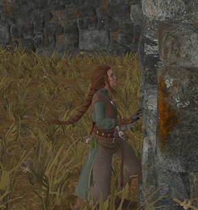
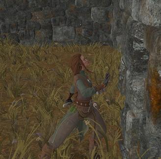
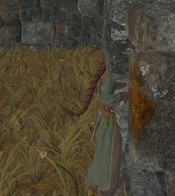
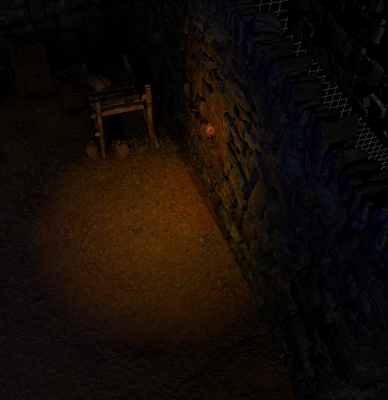
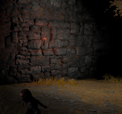
When placing art on top of collisions pay attention that the collision won't come on top of the art. If you run to a wall and the collision hits you before you are close to the art it will just look silly.
Below we have some examples of the art's distance to the collision.
Some useful buttons
- Space bar - Toggle between Global, Local and Screenspace transform and rotation
- K - Allows you to see lights through collisions
- J - Makes the lights stay the same size no matter how far you are from them
- Ctrl + T replaces selected instance in the scene with the type selected in type tree
- L - Hides lights
- G - Hides lights and all objects that don't have the VisibleInGame on
- P - Selecting an instance within a scene and pressing P Locates selected instance in the type tree
- Ctrl + G - Hides grid
- Control + Left click on a layer hides it.
Some tips about the type tree
TypeRoot -> InstanceBase -> Entity -> ObjectEntity -> object You will find all the objects here
TypeRoot -> InstanceBase -> Entity -> LightEntity You will find all the lights here
Finding items in type tree can be a little bit tricky at times as some tiny problems may occur. When you search for something that has multiple types under it they might not show for some reason. For example if you search for RockCollisionHelper in the type tree it might only show the RockCollisionHelper instead of all it's variations like BookRockCollisionHelper etc. This can be fixed by either searching again by typing the desired thing in the search bar or manually clicking the tree to find it. Also after using one object and then trying to find another object in the type tree, make sure to check the object you used isn't active anymore. Otherwise the Search bar won't search anything. You can just click anywhere in the empty part of the map to make sure you don't have any object active.
Other useful tips
Tools -> Options -> properties -> Order Properties In Property Grid to get properties in property window ordered alphabetically
Tools -> Options -> Tool -> Selection highlight self illumination enabled to get rid of the blue highlight when selecting objects
The collisions have VisibleInGame on in this map so that you can see them when you play. It's good to turn them of after you have addded art on them so that you can take a better look at the art. You can make the collisions invisible by choosing the collision, going into its properties and tapping VisibleInGame off from the ModelComponent.
General Level Art Workflow Tips
- It's recommended to start with the big shapes and when they work, move on to the finer details
- Try to get the "flow" of the level nailed in the blocking phase
- Think of the lighting and it's implementation ideas from the very beginning. It helps when placing assets into the scene, and you can adjust the lighting while progressing with the level art
- The key is to build the whole level layer by layer, by making iterations
- The assets can be used in many ways, don't let the assets' assumed original purpose restrict your creativity! As long as it looks good anything is allowed
- Remember to test how your level looks like when playing and running around with the character
- It's recommended to use reference images of real life geography and/or architecture to come up with interesting environment ideas
Lighting
"When lighting a map, the key items are SunDirectionalLightEntity and PointLightEntity. The SunDirectionalLightEntity is used to create shadows and the angle they come from and PointLights are used to give some additional lighting to make more realistic or just cool-looking things."
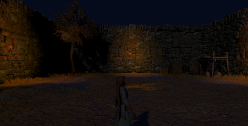
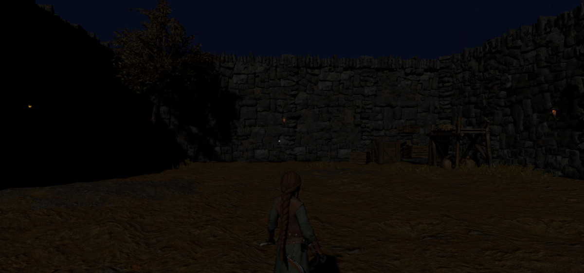
"Lighting has a huge impact on the feel and overall look of the map. Here we have an example of a simple evening/night lighting. Orange light from the torches and some bluish light to even it out. And some really faint sunlight to go with them."
Lighting is a really essential part for level art as it pretty much sets the mood for the map.
Two most essential lights in the editor are SunDirectionalLightEntity and PointLightEntity.
All maps start as black as there are no lights first. Sometimes level designers use Force ambient (pretty close to the layers in the editor) to get some light before lights are added.
AmbientLightEntity is most often used as a global ambient light to set the base tone of the scene. If both color components are identical, they will create the effect of a uniformly lit scene. AmbientLightEntity can also be used as a directional light of sorts, if the Color2 component is a darker shade than Color1 component, as it is by default. This still mimics the behaviour of radiative transfer (absorption, emission, scattering), since AmbientLightEntity can't create shadows.
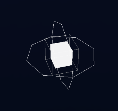
PointLightEntity is used to give some additional lighting to make more realistic or just cool-looking lighting.
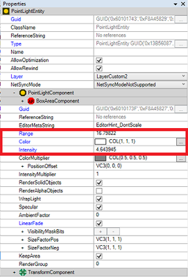
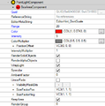
"You can edit the light's intensity and range in its properties section under PointLightComponent. Also take note that PointLights always go through art and never make a shadow. And Linear fade is your friend. It can smoothen the light's path so the light goes a little bit further and makes it so you don't have to make the range and intensity so high."
PointLightEntity with RenderAlphaObjects
PointLightEntities can also be used to light alpha objects, like spiderwebs, fogs, clouds etc. In editor the RenderAlphaObjects property can be set to turn a PointLightEntity into an "AlphaBlendPointLightEntity".
It's noteworthy, that once RenderAlphaObjects is on, changing the Range property isn't anymore enough to change the actual range of the light, also the Radius property should be changed to the same value under PointLightComponent-->PointLightAreaComponent-->SphereAreaComponent->Radius. This only applies to manual editing of Range and Radius, if the scale tool is used to change the range of the point light, the radius is increased automatically.
"The next room is exactly the same as the first one but without the lights. You can see there are some shadows but without additional light everything looks really bleak."
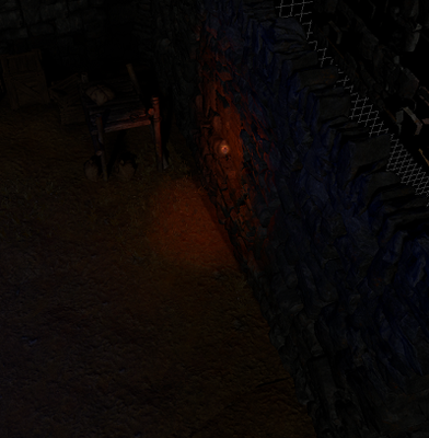
"See how the color of the light affects the overall look? This room looks gray and dull. Also the edges of the spotlights look really sharp and awkward. And it looks bad when there are torches but the light doesn't match the light that would come form a fire. One of the wall's has it's pointlight's LinearFade disabled. As you can see the difference is quite visible."
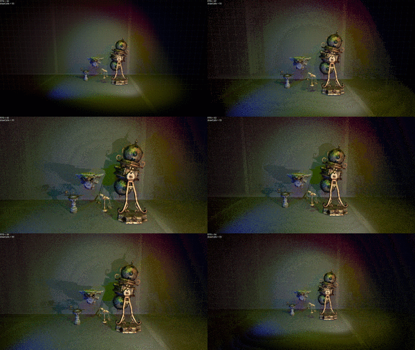
Below is an example of how the LinearFade affects the lighting. Note how color is affected. Take this into account while picking the color of the light and how you're going to use it.
SpotLightEntity
Spot lights are like directional lights but the light projection is different. The light is projected in a cone and the shadow projection is perspective instead of ortographic. A flashlight is an example of a spot light. Spotlights are usually used in combination with point lights to create more realistic lighting conditions.
SpotLightEntity is the spot light of Trine 3. It shares many of the properties with DirectionalLightEntity (and SunDirectionalLightEntity), since DirectionalLightComponent is a child type of SpotLightComponent. A SpotLightEntity's range, color, intensity, fov and many other properties can be changed at will to reach the desired lighting conditions. SpotLightEntity has also a property called LinearFade. If it's false, the light attenuation of the spot light is more "natural" and fades faster. If set to true, the intensity of the spot light fades linearly, i.e. it's value decreases like 1.0/distance (instead of 1.0/distance squared).
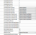
SpotLightEntities have ShadowQuality set by default to ShadowQuality4. If there are more than four SpotLightEntities with ShadowQuality4 in view, the shadows will start flickering. The same applies to SpotLightEntities with lower ShadowQuality so that
- 4 x ShadowQuality1 = 1 x ShadowQuality2
- 4 x ShadowQuality2 = 1 x ShadowQuality3 and
- 4 x ShadowQuality3 = 1 x ShadowQuality4
All in all there can be a maximum number of 10 shadow casting SpotLightEntities in view at the same time.
Extra Section: Creating Trine-like lightning
Step by step instructions:
- First add ColorEntity, AmbientLightEntity, BloomEntity (Glow) and SunLight
- Then add the Filmic color effect to the ColorEntity and use factor 1. This is the base adjustments of all Trine-style environments. Build the lighting on top of this and make it as perfect with the Editor's lights as possible
- Once the lighting of the level is finished the color effect can be adjusted further to achieve your vision perfectly
- Sun determines the shadows of the environment and how bright the light areas are
- If the sun light seems weird and has edges, change the cascade setting bigger
- If the shadows are too pixelated or blurred, adjust the ShadowFilterScale, on default it's 1, if you want it blurred you can change it to for example 0.6. Also the render settings quality affects to it.
- Ambient light adds light to the whole thing, also shadow areas like an adjustment layer in photoshop
- Ambient light can be rotated and it has two colors Color1 and Color2 that come from opposite directions. By changing the colors and rotation you can achieve for example an ambient lighting that is blue from the bottom and purple from the top areas
- From the ambient light settings you can also adjust the particle effects' color to match the rest of the lighting
- It's possible to adjust the strength of the lights using the diffuse color adjustment and only operating the value or just from the intensity setting in properties. So light's color value = light's intensity, but the range is greater with the intensity adjustment.
- You can use PointLight and DirectionalLight for your basic lighting needs like making bounce light
- BloomEntity's/Glow's most important adjustments are Glow scale, strength and length
- The color of the objects and how brightly they are lit have an effect to the glow
- The position of the bloom entity matters in the scene, it can also be animated to follow the camera and change value by using property connections and areas and area combiner entity
If you wish to know more about setting lights to your level, check also: Lightning in editor
Shadows
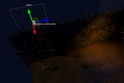
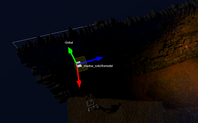
"Sometimes light can come through the art pieces and mess with the wanted shadows. In cases like this you can use fake shadows to block the light. For example the left wall has some fake shadows on them. Check it out in editing mode."
There are times when adding additional shadows is necessary to make the map look better. Some parts might look a little bit bland without them and sometimes light can come through the art. For example a wall might not have a shadow because the sunlight just shines through. In this case you can use a fake shadow to fix the issue.
There are times when maps can look better with a little less realistic look with additional shadows and/or lighting but that is for you to decide.
"There are 3 kinds of shadows: fake_shadow_gradient.fbxmodel, fake_shadow_gradient_radial.fbxmodel and fake_shadow_solid.fbxmodel. The solid one is used to block lights by placing the black area to point towards light source (the other side is invisible). The other two are used to give walls etc. some extra shading."
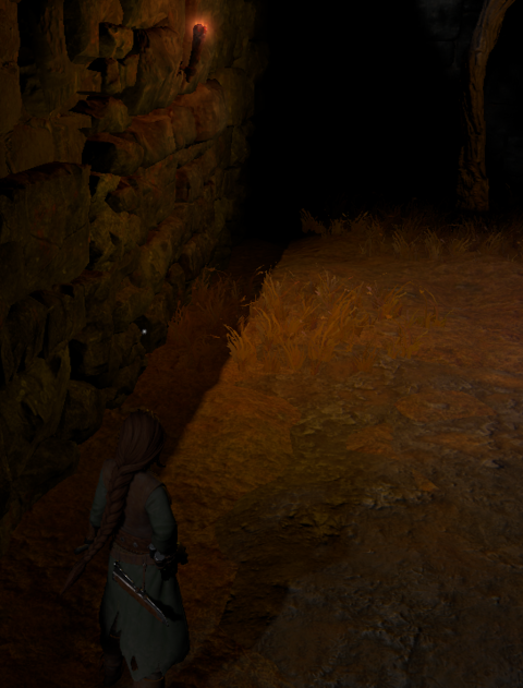
"When adding shadows, take the lights into account. For example the left wall in this room has a strong shadow at the bottom of the wall under the torch and it doesn't look good. It looks like the shadow isn't affected by the light at all which makes the wall look pretty funny. Also take note how the shadow only works if you look at it from more or less straight ahead. If you come around from the last corner the shadow becomes visible only when you move the angle somewhat."
"This room as many unnecessarily added fake shadows. Try moving those boxes and see how there are some really dark shadows under them. also check out that tree. the tree itself isn't that dark, yet the ground under it is almost black."
Ground art pieces are kinda bumpy and sometimes they will look a little bit funny after lights have been added.
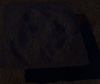
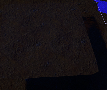
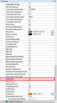
This can be fixed by using ShadowBias that can be found on the object's properties and changing it to value 0.1. Below will be examples and you can see how big the difference is.
Art
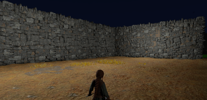
"In this room we have some example walls. The middle wall consists of the same piece over and over whereas the right and left wall have been altered a little bit. Using the same piece over and over again will not look so good but a little change goes long way. The same applies to pretty much to any object that is used multiple time. Go and see if you can spot the difference between walls."
-ASSIGNMENT-
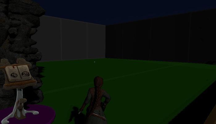
"This last room is meant for you to try out the things you've learned. You can either use the same art as in the earlier rooms or you can search the type tree or art category for more options. Art category can be found in Categories -> category root -> art. Have fun!
The collisions have been made visible so you can take a look at the room. When you start adding art just make the collision invisible in-game again in the collision's Modelcomponent -> VisibleInGame."
It is time for this tutorial's assignment! Pause to think for a bit what you want to build and what would be the best way to go about it. Obviously some light is needed since the room is kind of dark to work with. The best way to go about it in the beginning is to use Force ambient. Looks a bit brighter now? So much easier to see the walls and the floor...
In the beginning of this wiki page you can find some tips and tricks to remind you how to go about things! Have a happy art spree and remember your layers! Shadows are easily lost in the wrong layers...
Shadwen Editor Tutorial Main Page
-> Next tutorial (Hinge Joints)
<- Previous tutorial (Prefabs)
