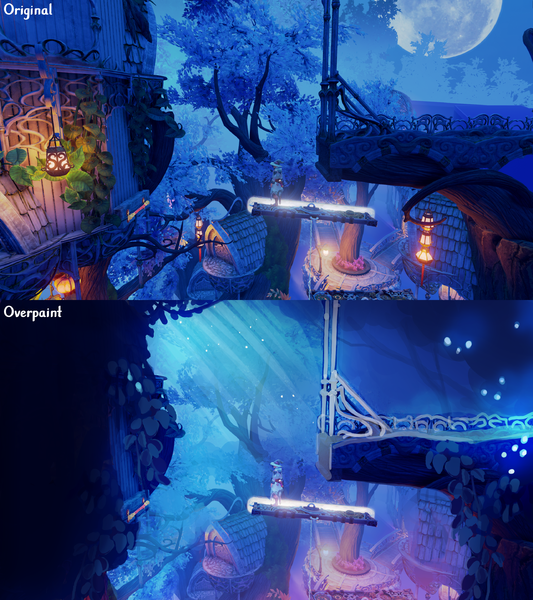
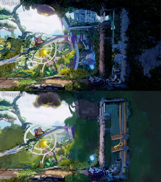
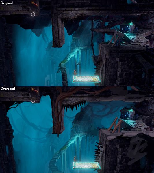
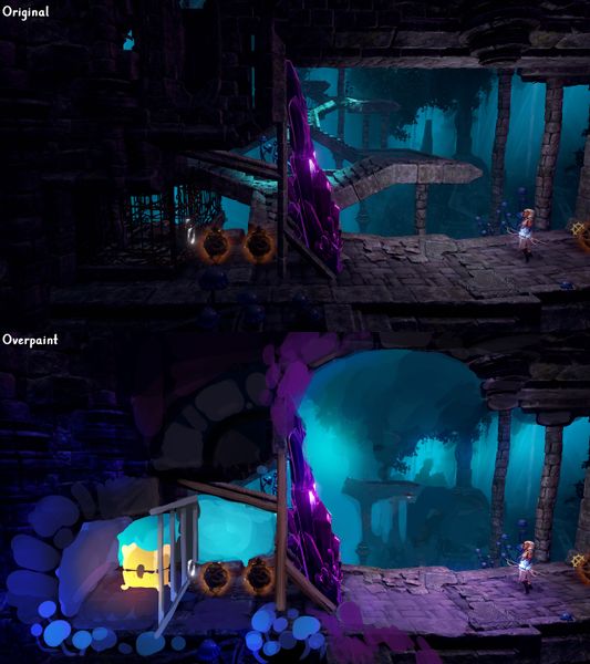
Public Level Art
Color is a combination of value, hue and saturation
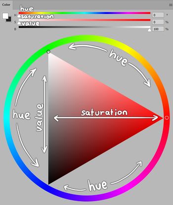
- Color is made of three things: VALUE, HUE and SATURATION
- Color is always relative and the context determines how colors are interpreted
- The most important aspect of color is the value of color, meaning the darkness or lightness of a color. This attribute will be seen even clearer if the image is turned into a grayscale mode
- Hue means the actual color, for example the hue of the color can be red, yellow, blue, orange, green, purple and anything between those
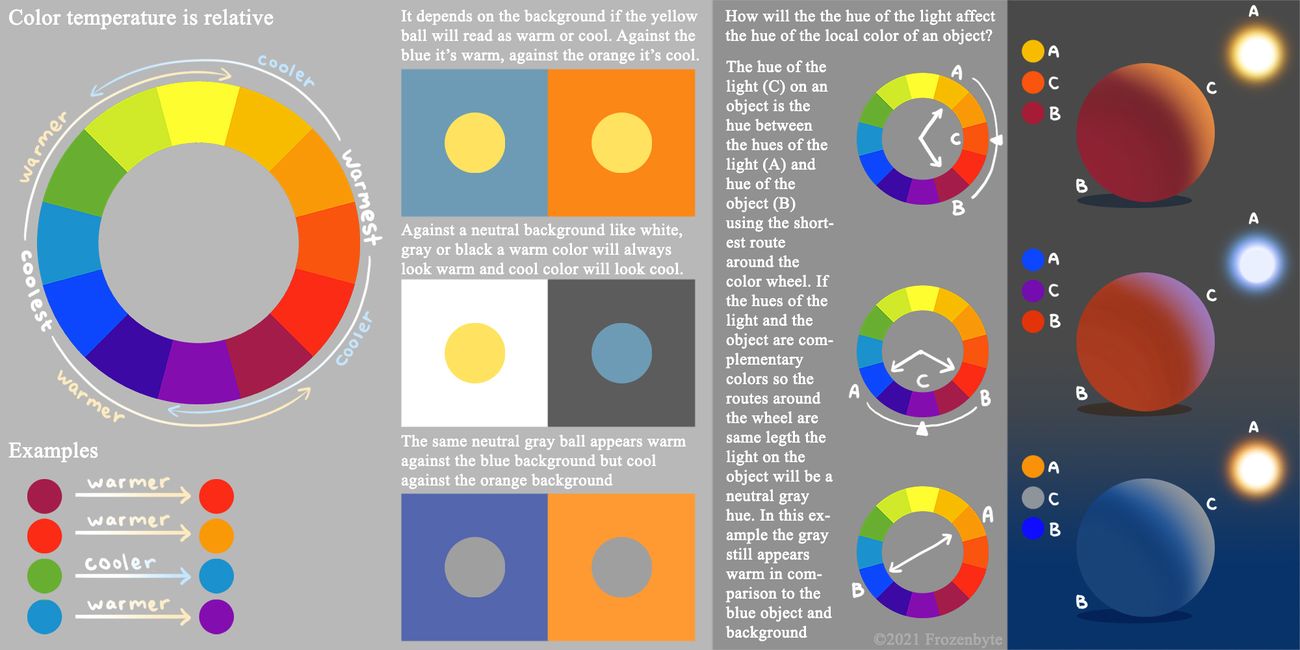
- The hue can be cold or warm, so there can be warm or cool temperature for the hue. This, as everything with colors, is always relative and depends on the other colors around the color in question. Colors always exist in some environment that affects them
- A hue can look warm next to a cooler hue or cool next to a warmer hue. A value can look darker next to a lighter value and lighter next to a darker value, and this is true for saturation too
- Saturation determines how vibrant the color is. A very saturated color is vibrant and desaturated color is muted and closer to gray
- Lighting and colors are always tied together. When designing a lighting, first determine what you want to achieve with the color choices and keep your intention in mind while building the lighting
- It's best to always think about the contrast. Where do you want to add contrast and guide the eye to look at using value, hue and saturation? And where do you want to keep attention away from with low contrast? Usually the answer is simply that we want to guide the player to the right direction and highlight important gameplay objects while fading the irrelevant things to the background. For transition areas between the puzzles we might also want to create beautiful visual focal points where the attention is completely directed at the art.
- We never want to create confusion or frustration by guiding the player to an area with nothing in there: For example by making an area that is difficult to reach look like there is an entrance to a secret and cause the player struggle to get there only to realize there's nothing in there after all.
- Here: Level Art Related Gameplay Issues: Distracting Level Art, are several examples of the issues dysfunctional colors and lighting can create for the player

Gamut masking


Value
With values you can create contrast or unity by using light and dark colors
- Some vocabulary:
- Value = the darkness/lightness, can be most clearly seen in a greyscale image but is present in a full color image as well
- Contrast = Relative difference between different values in an image. For example: there is a big (the biggest possible in fact) contrast between black and white and less contrast between gray and white
- Noise = small details with strong contrast that create visually noisy feeling
- With values (as well as other aspects of color) it is crucial to remember everything is relative! A value can look bright or dark depending on what value it is compared to
- When simplified, each image is just a bunch of different value blobs arranged into a composition
- The relative difference in the values between these blobs can be used to make things blend in or pop out
- To make things pop out doesn't always mean to make them super bright, because this won't work in a bright environment as everything else is bright as well. It's all relative to the surroundings so it's all about values and contrasts in each different context.
- If the difference between the values is big, then there is contrast which means that those things stand out more
- If the difference between values is small then there is no contrast and the things don't stand out but blend in instead
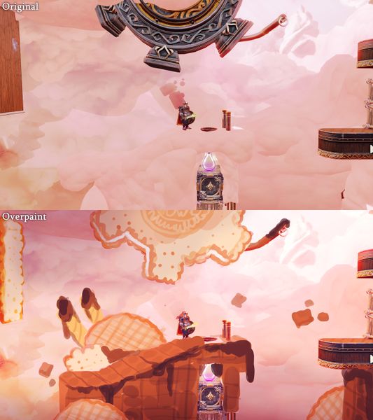
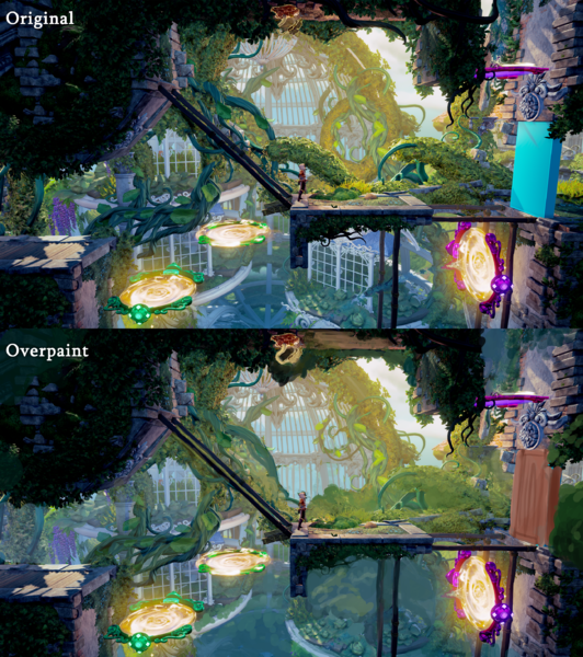
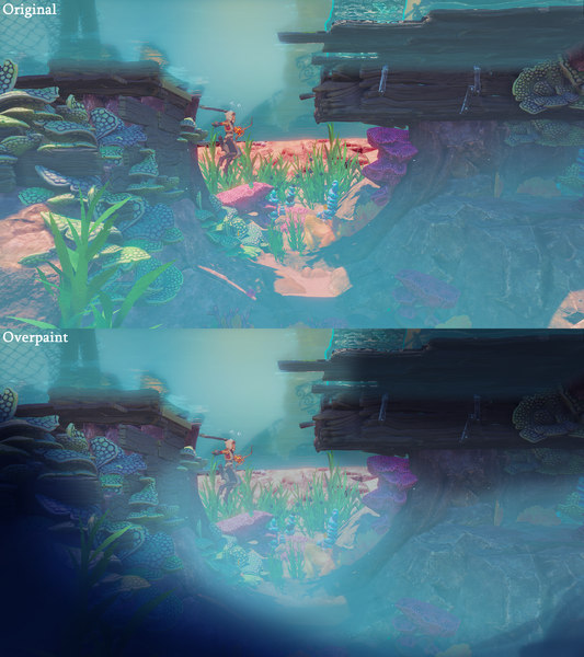
- Adjusting values in level art can be achieved with lighting, fog or albedo color or all of these
- In games we can guide the player's eye where we want, for example to concentrate on beautiful visual details or to important gameplay objects. At the same time we don't want the player to concentrate on irrelevant things.
- Irrelevant/background objects/areas should blend in
- Important objects/areas that need to be highlighted have to pop out by either being a dark object on a bright background or vice versa, simple as that!
- If the important object is surrounded by noisy irrelevant visuals it will be lost in the visual noise. So it's good to have clear surroundings for these important objects. That way the contrast can be controlled and adjusted to highlight the important objects and blend in the irrelevant things.

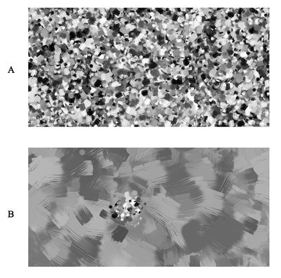
- A) The same level of detail and contrast everywhere creates a noisy feeling and it's hard to figure out where the focus should be
- B) Less detail and contrast in the environment and a higher level of detail and contrast in one area makes it much easier to decide where to focus
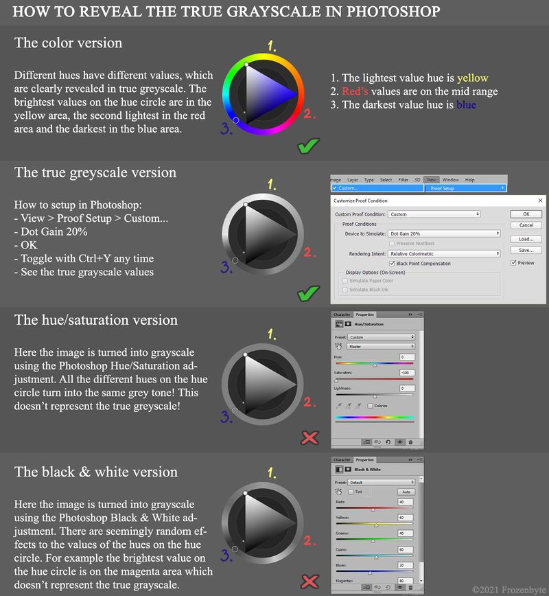
How to check the true values of an image in Photoshop
- It's not as easy to see the different values and their relations while the image is in full color as the different hues and saturation can complicate things a lot
- It is crucial for any artist to be able to check the values of an image and the best way to do this is to look at the image in a grayscale mode
- The areas with most contrast between different values are the areas the eye catches first in an image
- If an image doesn't look good and clear in grayscale, it will not work in color mode either
- You might think that the hue/saturation adjustment or some other Photoshop grayscale adjustment works just fine but actually they don't
- To see the true values of an image in Photoshop use the proof color setup
- Select View -> Proof Setup -> Custom...
- "Device to Simulate: Dot Grain 20%", "Render Intent: Relative Colorimetric", "Black Point Compensation" checked
- Now you can switch between the basic color mode and the true greyscale mode to check the true values colors using CTRL+Y any time
- You can for example check a screenshot's values in Photoshop with this method when designing the lighting and colors or trying to find out how to make the scene clearer

Guiding the player with values
- Simplify how you see forms and value. Everything you see is just blobs of value, it really isn't more complicated than that.
- It's either light or dark. A light colored thing pops out on a dark background, but blends in into a light background
- This is true for anything, any theme, foreground, gameplay area and background, for landscapes as well as characters
- What is the area with the most contrast in the scene? Is that where we want the player to look? If not, then the contrast is in the wrong place.
- Does the important thing lack contrast and blend in? Create contrast: if the thing is bright in value, put dark around it, if the thing is dark value, put bright around it.
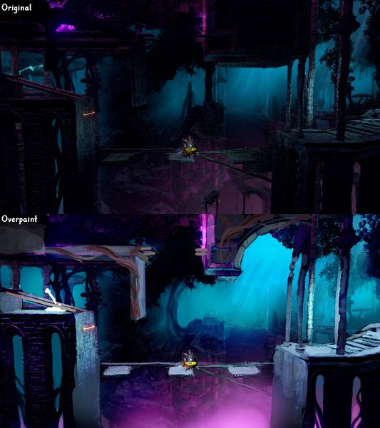
- How to make the route clear? Guide the player with the values, have darker areas on the edges where the player is not supposed to go. Make sure the right path is clear and pops out.
- Pay attention to values and contrasts and use them to make important things pop out and unimportant things blend in
-
The gameplay route is same material and value as the background so it's hard to see the gameplay route
-
The background has noise so important things aren't highlighted enough and they are lost in the background
-
The values are flat so they don't guide the player to the right direction
-
The values are random noise so they don't guide the player to the right direction
Bring out the important gameplay objects with values
- Examples of situations where the gameplay area and objects aren't visible enough due to the value issues
-
The important gameplay items aren't clear as the values don't bring them out enough
-
The spikes, the platforms and the gameplay area poles don't stand out enough. It could also be made clearer that the level doesn't continue to the left here.
-
The chest and the gameplay area poles don't stand out enough. The background structures make the scene less clear.
-
The lever, the platforms and the gameplay area poles don't stand out enough
Create depth with values
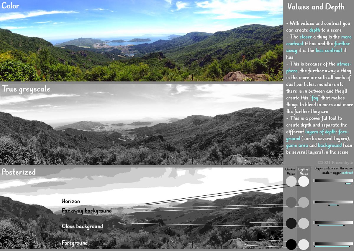
- With values and contrasts you can create a sense of depth to a scene. Adding depth will make the general feeling less flat.
- A simple rule of thumb is that the closer a thing is, the more contrast it has and the further away it is the less contrast it has
- This is because of the atmosphere, the further away a thing is the more air with all sorts of dust particles, moisture etc. there is in between and they'll create "fog" that makes things blend together more and more the further they are. This fog can have its own hue too depending on the colors of the scene. For example if the sky is blue things get bluer the further away they are in the background.
- This is a powerful tool to create depth and separate the different layers of depth: foreground (can be several layers), game area and background (can be several layers) in the scene
- It's a common problem in level art that some things on the background appear as if they were on the gameplay area and this can be helped with clear levels of depth

Hue
With hues you can create contrast or unity by using warm and cool colors
- The understanding of the contrast between warm and cool hues is a great tool when building the color scheme of a scene
- For example The color of the light can be warm orange while the color of the shadows is cool blue, this creates an appealing contrast between the light and shadow areas
- The hues of the sunlight will change depending of the time of the day and also different seasons throughout the year affect the colors as well as the humidity or cleanliness of the air
- Do use real life as a reference for creating different lighting scenarios. Even though Trine world is a fantasy world we want to stick to believable real lighting scenarios that people recognize.
- We can take real world lighting and emphasize and exaggerate it, but everything should start from a deep understanding of realistic lighting
- Different light sources have different hues in them, normal fire has orange tones but different magical elements can turn lights into all the different hues. Magical mushrooms or crystals for example can glow in any hue!

Hues Indicating Emotions
- For example many movies use a certain color to communicate a certain mood, you can observe this yourself though often it's done in a quite subtle way
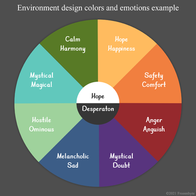
- The different hues of colors can be used to create different types of mood and to communicate a certain emotion visually
- Any color can be chosen to communicate any mood as long as the colors chosen for the specific moods stay consistent throughout the game
- There are certain hues that tend to be used for certain moods more often depending on the cultural environment so using those stereotypes as is or turned on their head can be ways to use hues to indicate moods
- Here is just one example how the hues could work consistently supporting the mood and emotions of the story

Examples of using hues to determine the mood
-
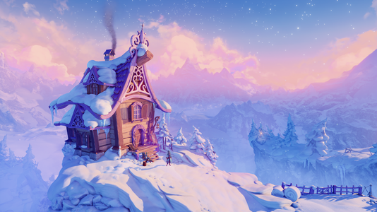
Light pastel colors to establish a calm environment
-
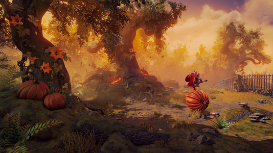
Warm and welcoming feeling with yellows and oranges
-
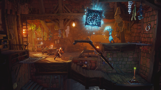
A warm and cozy color scheme for the friendly Badger's home den
-
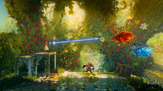
Lush green calming environment
-
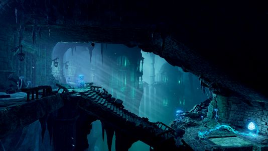
This environment is meant to be uninviting and menacing so pale cool greenish blue hues are used to achieve that atmosphere
-
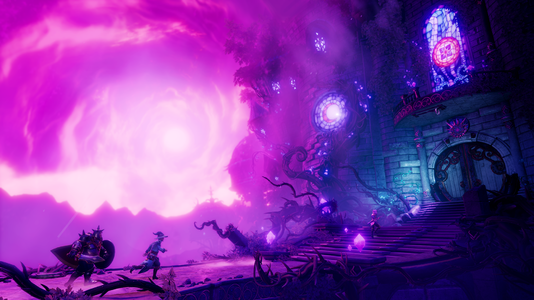
Menacing mysterious feeling created with purple tones
-
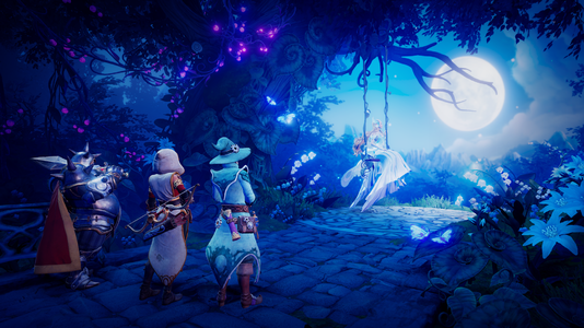
Calm and more friendly mysterious feeling created with blue tones
Saturation
With saturation you can create contrast or unity by using vibrant and muted colors
- Saturation means the purity of the hue
- With maximum saturation the color is purest and most vibrant and with less saturation the color turns more towards gray
- Just like with values and hue you can also use saturation to guide the eye of the player
- In a desaturated environment a saturated spot will grab your attention
- Trine series is known for its colorful environments but being colorful doesn't mean that every color has to be at the maximum saturation
- If everything is very saturated it can become visually overwhelming quickly so generally it's good to be mindful when deciding which areas should have a lot of saturation
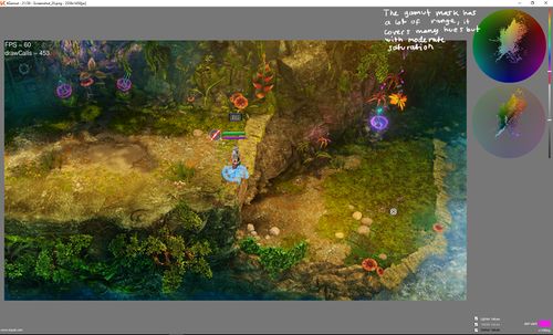
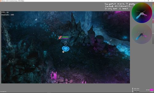
- The saturation can also be explored using gamut masks mentioned earlier in this article
