Level Art: Level Art Related Gameplay Issues
Level Art Should Support Gameplay
- The purpose of the Level Art is to make the game beautiful - and also support the gameplay.
- This section of the Wiki contains general guidelines on how to avoid creating misleading level art causing gameplay issues.
- In the examples below, the level art obfuscates and misguides the player in both obvious and more subtle ways.
- The examples below are for educational purposes only - some of the cases are fictional and constructed to showcase level art issues. Some are from the early stages of development and do not represent the finalized product.
- Level artists should frequently play the level or scene they are working on. That helps to spot any gameplay issues the level art may cause. It's impossible to notice some errors while using the free Editor view only - that's not what the players see - so it's essential to play the game.
Art Hides Something Important
- Don't place the foreground art carelessly so that it covers something important, like puzzle elements or a ledge requiring the player to see exactly where the character is.
- The Player character should always be visible, so be mindful of your foreground art. For example, the camera should be adjusted so that the doorways in the gameplay area never hide the player character completely.
- Sometimes level art is intentionally used to hide gameplay elements, like XP and secret areas. On the other hand, if an item is essential for the player's progression, it should always be fully visible and in plain sight.
- The composition of the scene should emphasize important gameplay elements. Draw the player's eye towards things relevant to the gameplay.
-
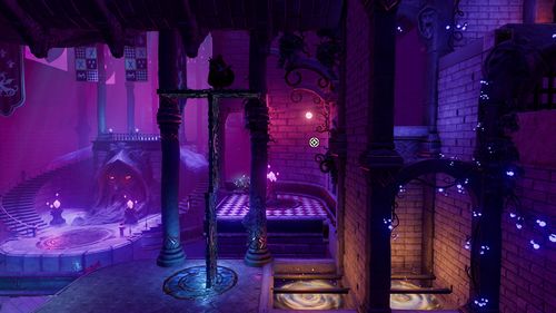
 The button needed to open the door is hidden behind the foreground visuals, namely the handrail. While the player might spot the button eventually, they are left confused and annoyed.
 -
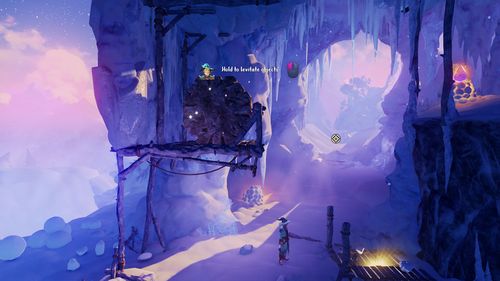
 The player needs to levitate a wizard's box through a hole in the right. The branches and leaves obstruct the view too much, making the conveniently box-sized hole hard to see.
 -
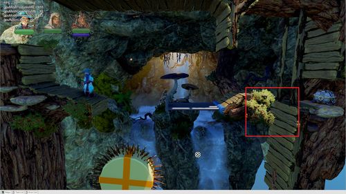
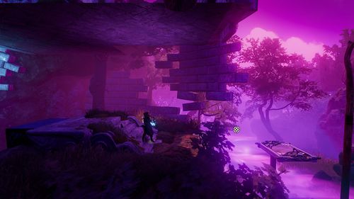
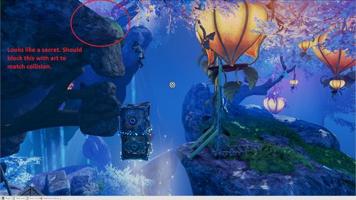
 The entrance to a secret cave remains a little too secretive due to a thick rock asset blocking the visibility.
 -
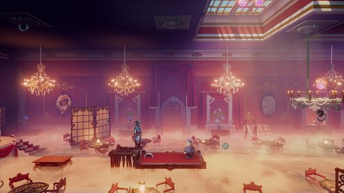
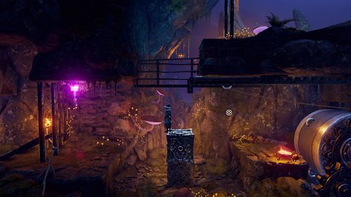
 There are too many assets and elements in front of the camera and blocking the view. The buttons on the ground are not visible enough.
 -
 Level art elements are placed confusingly, blocking the view. The player will likely run to their death before realizing there's a pit.
 -
 The bushes are hiding a part of a ledge, likely causing the player to fall and die.
 -
 The platform going down is hidden inside the floor, leaving the player confused and guessing where to go.
 -
 Covering a ledge with a flower vase may result in an unintentional falling down.
 -
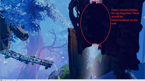 While the airflow elevator is a fantastic element, the level art prevents the player from seeing their character for a (too) long time.
 -
 While the intended progression route is simple enough to understand, proceeding requires a leap of faith, which might make some players uneasy. Solutions like this should be avoided.
 -
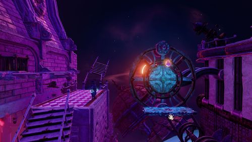
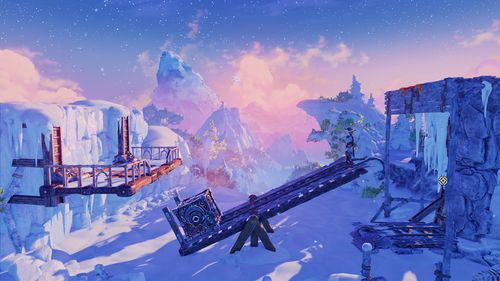 The rails at the right-side end of the seesaw plank are broken. It's hard to pinpoint where the platform area ends.


Art Hides Something Important in Multiplayer
- Because the camera angles are often wider in multiplayer modes, you should be extra careful when placing the foreground elements.
- Typically, all players should always be in the same view.
- Vertical scenes are the most challenging to implement: When one player climbs up on a platform, they should be as visible as another player at the very bottom of the scene.
-
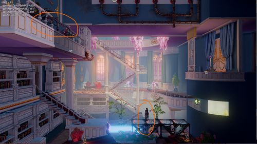 Image A: The character standing on a balcony (higher area) is almost entirely obscured by the foreground artwork. See Image B to see how this was fixed.
 -
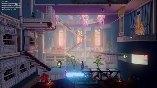 Image B: Almost the entire balcony was removed to help the player to notice the character.
 -
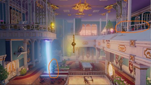 Image C: When using very wide multiplayer camera angles, even the relatively small foreground assets can obscure the player characters. See Image D to see how this was fixed.
 -
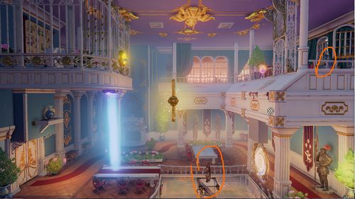 Image D: The foreground area was moved very close to the playable area.
 -
 All the fixes applied must work with both multiplayer and single-player camera angles. For example, multiplayer situations where the camera is moved closer to the player character might be tricky with the single-player mode.
 -
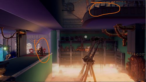 Image E: A vertical progression path and a wide camera angle aren't a good match, making it really hard to see the characters. See Image F to see how this was fixed.
 -
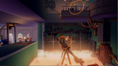 Image F: The foreground art was moved very close to the playable area to make the characters more visible.


Fading Environment Objects in Trine
- The environment objects should be faded only when they're used as secrets.
- If something is faded out upon entering an area, it should be faded back in when the secret area is left.
- The fading effect should not be used, for example, to a wall facing the camera during a standard progression route.
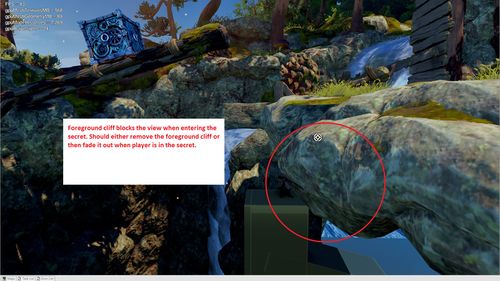
- As the video shows, exceptions can be made, but only after setting up the cameras so that the character can't remain standing in the doorway.
- The situation depicted in the video showcases how the cameras and level art work together to create the desired effect. The camera doesn't go through the wall, but the level artist can plant a window on the camera's path. The player should feel safe when jumping to the unknown, so you might want to include another door or a window in the scene's foreground to show that the path continues to the other side.
- Enable UseNoisedVisibility on modelcomponent of the object being faded to make the fading effect smooth and avoid flickering like shown on the video.
Collision Mismatches
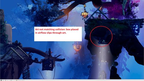
- The level art should always match collisions as closely as possible.
- If the collision is smaller than the art asset, the characters or levitated objects will clip through the art when interacting with the collision point.
- If the collision is bigger than the art asset, the characters or levitated objects will float in the air when interacting with the collision point.
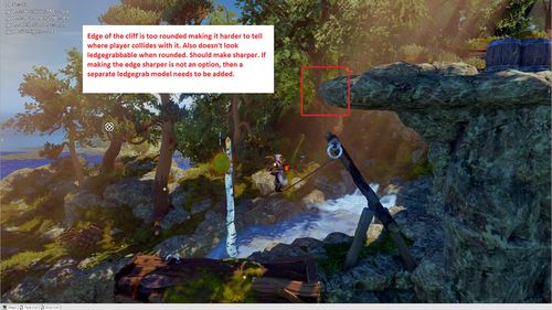
- If the collision in a particular area is intended to be sharp, try to avoid round and edged art.
- Pay particularly close attention to the edges that are ledge-grabbable.
-
 If you're struggling to create a 90-degree ledge with stone assets, try replacing them with a man-made structure instead.
 -
 The player characters aren't the only gameplay elements affected by the collision mismatches; they are also problematic for dynamic objects.
 -
 The Player character shouldn't be able to move inside the snowman art - also, the character seems to collide with an invisible collision on the left.
 -
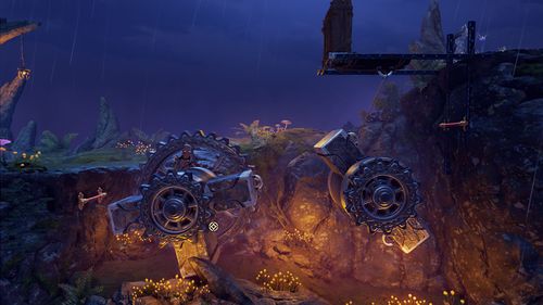 The centrepieces of these rotating puzzle elements are missing their collisions.


Distracting Level Art
- When a game combines a 2D gameplay with a 3D environment, it can be hard to differentiate the background items from the gameplay area. If the player doesn't have a clear understanding of the gameplay area, they get easily frustrated.
- At all times, the player should be able to differentiate the gameplay area from background and foreground areas.
- If the critical gameplay elements are lost amidst the background art, it'll disturb the smooth flow of the playing experience.
- The level geometry should be free from any confusing elements and easy enough to grasp with a single glance.
- Tip: Try to distance yourself from your work by shrinking the level to a very small size (you can use screenshots, for example) or take a step back and squint your eyes. If you can't instantly recognize the general shape of the level, there's probably something wrong with the visuals.
- You can learn more about fixing and (preferably) avoiding gameplay-related level art issues by studying the importance of values and contrast
-
 Since the gameplay area is unclear and lacks any guidance signs, the player wouldn't probably know where to go.
 -
 The background art is too close to the gameplay area, making it hard to differentiate the two. The art in the background draws the player's attention, whereas it should emphasize the actual gameplay area.
 -
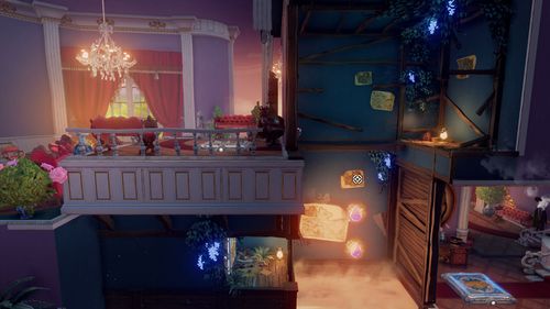
 There are so many decorative background objects in the scene that it's hard to understand which items are in the gameplay area and meant to double as platforms.
 -
 Did you notice there is a vertical button located in the bottom left area? The art assets in the scene are hugging all the attention, making it hard to spot the actual gameplay elements.
 -
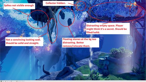
 It's difficult to see the spikes amidst all the other level art elements. Make sure to boost the visibility of the critical gameplay assets with the correct values and contrast.
 -
 The spikes around the button on the top right corner should be clearly visible, as they are an essential part of the gameplay.
 -
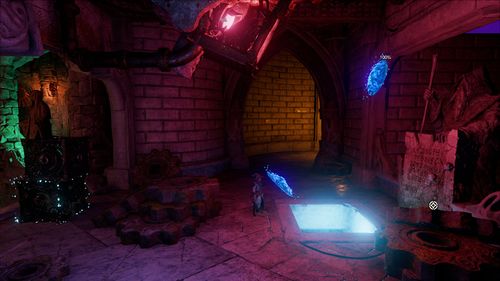
 It's easy enough to mistake the circular magnetic area for a part of the floor.
 -
 The two circular magnetic plates on the wheel are hard to see - or understand their significance as gameplay elements. The middle part of the wheel draws attention instead. Don't use the same colour for decorative pieces and gameplay elements.
 -
 A bright yellow effect to signal a landing area for levitation objects was tested. However, the effect was easy enough to misinterpret to represent a collectable, a hidden door, a levitation object - to name but a few - rendering it more confusing than helpful.
 -
 Even the very preliminary base art should always be created with the gameplay in mind.
 -
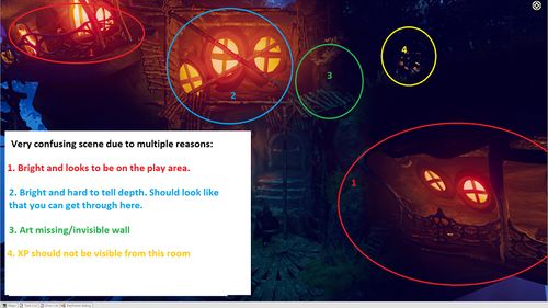
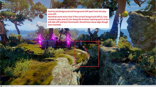 It's hard to tell where the gameplay area starts or stops. The confusion is caused by a mixture of unclear lighting and vague rock assets littered around the area.
 -
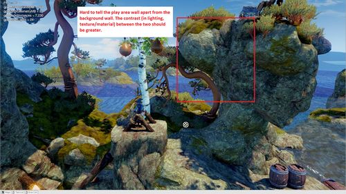 The values selected are not in line with varying depth levels, resulting in a perplexing gameplay area. The background appears to be blending into the gameplay area.


Gameplay Route Issues
- If the player's intended progress route isn't clear enough, it's good to check the level art of the area.
- Level art may mislead the player into thinking that a route is safe, dangerous or somehow blocked when it actually isn't.
- The player should always know where to go and what's happening. To achieve that, the main path should always be obvious and easy to follow.
- If more than visual fixes are needed to highlight the main route, talk with the designer responsible for the level.
- Avoid planting hidden or obstructed entrances along the main path. The entries to hidden or secret areas should always be visually less tempting than the main path.
-
 The horizontal stone pillar seen through the magnetic field is problematic: It's too close to the play area, making it hard to differentiate from the platforms and the magnetic field itself.
 -
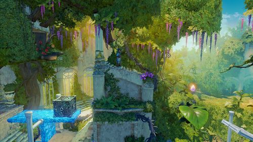
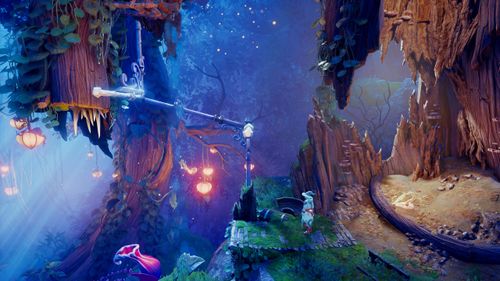
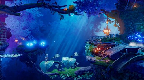
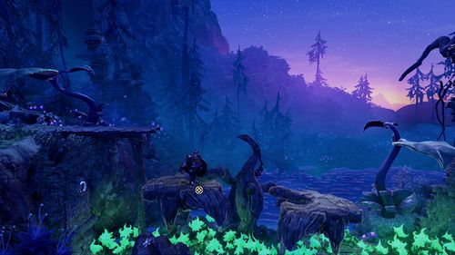
 Some of the large leaves depicted are gameplay elements, and some are purely decorative. The risk of a mix-up is evident.
 -
 While the hatch upwards has been opened and it's clear to proceed, the decorative crate art makes it hard to understand.
 -
 The gameplay elements should always stand out and direct the player. The large leaves are in the gameplay area and meant to act as platforms - while the branch underneath them is not. The player has no way of telling which platforms are safe. The tree branch should remain hidden in the shadows, preferably with a layer of fog camouflaging it more.
 -
 The rock ledges in the foreground are too close to the gameplay area and easy to mistake as gameplay elements.
 -
 Especially with the camera set-up featured here, the player might assume the foreground structure near the bottom is a part of the gameplay area (while it's not).
 -
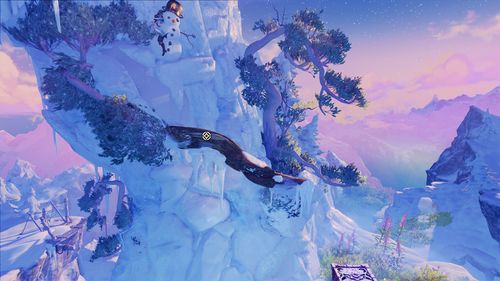
 It's hard to say which parts of the bird-shaped platform asset, if any, are located in the gameplay area. Possible fixes include adjusting the lighting or editing the asset textures to highlight the gameplay platforms and making other parts of the asset less visible.
 -
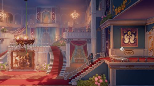
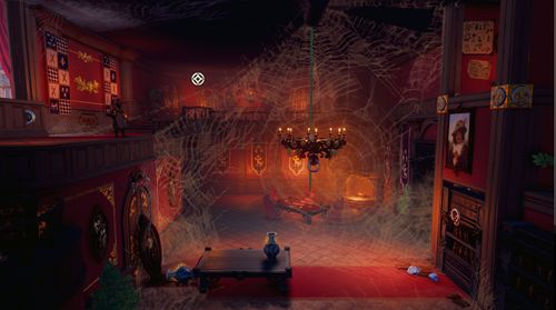 The secret area on the top right corner looks like the main route, and the actual main route below it appears to be a secret passage with the bookshelf covering it.
 -
The player should head downwards but is more likely tempted to progress to the right. Replacing the right side ledge with a solid wall could fix the problem. One should also pay attention to the warm light shining from the right - why invite the player to a place they can not go to?


Fire Through vs Non-fire Through
- It's wise to reserve iron bars, gratings and other gameplay area assets with holes in them to be used with fire-through collisions only.
- If the asset isn't supposed to pass the ammunition through, it should look solid.
-
 The player is tempted to try and shoot an arrow through the hatches - to no avail. While the actual solution to the puzzle requires the player to use the ice arrows to freeze one of the platforms, the level art should help them to understand how the bow and arrow can be utilized here.
 -
 This platform doesn't look solid enough to be frozen with an ice arrow either.


False Promise of Gameplay Function
- Avoid planting permanently closed doors on the gameplay area since players will want to open them. Doors leading to background areas are more acceptable.
- If the player can't go to a particular area, that area shouldn't look accessible.
-
 The opening on the left appears to be an entrance somewhere. Level art shouldn't invite the player to a place they can not enter.
 -
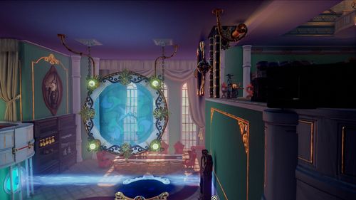
The bottom left door looks like an entrance to a secret room while it's just a decoration. Also, earlier during the level, the player could levitate a painting from the wall to reveal a stash of XP collectables. The painting on this scene, however, is just a decoration and can not be levitated. Inconsistencies can be extremely frustrating, and when faced with a situation like this, it's best to leave decorative assets, like paintings, outside the gameplay area completely.
-
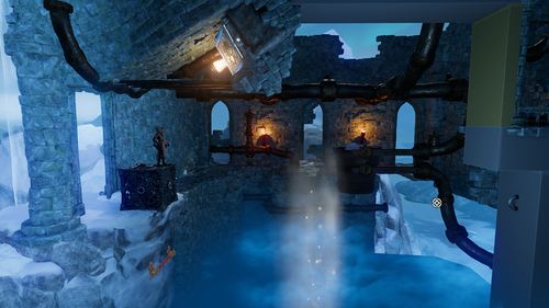
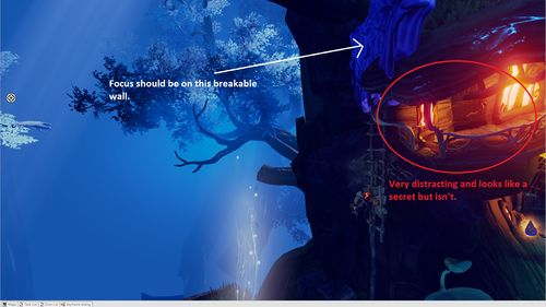 In the blue-toned surroundings, bright, warm lights will surely attract attention, while the actual gameplay element (the breakable wall near the lights) remains in the dark.
 -
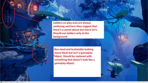 If there's a ladder in the gameplay area, the player will want to climb it, no matter if the character actually can. It isn't enjoyable to bump into obvious gameplay elements - and be unable to use them. You should leave unique-looking but functionless gameplay objects out of the gameplay area and insert them sparingly in the background. Level art should always support the possible gameplay elements.


Misleading Level Art
Fake Ledgegrabs
- Some art assets might look like ledge grab poles while they aren't. Be very careful not to place misleading art objects in areas that include actual ledge grab surfaces and objects.
- For example, it's not a good idea to set thin horizontal poles and real ledge-grabbable surfaces next to each other.
- Avoid sharp edges in spots where ledge-grabbing is not possible.
- Be extra careful when working on levels with detailed architecture: Visually distinct horizontal support beams, borders, and such can easily mix up with ledge grabs.
- Examples of structures that are easily confused as ledge grabs::
-
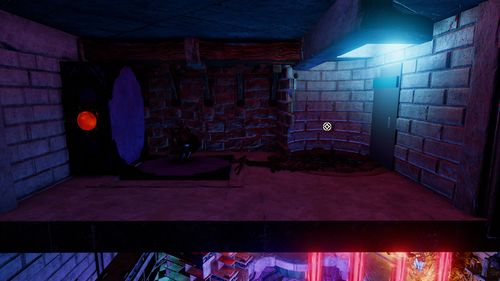
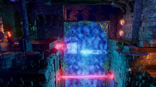
 The wall geometry near the portal falsely suggests the player can ledge grab.
 -
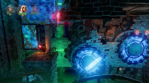
 The curved part of the right side ledge seems ledge-grabbable, while the actual ledge grab area slightly above it does not.
 -
The rock ledges in the foreground are too close to the gameplay area and easily mistaken as grabbable.


Fake Poles
- The poles have a very specific gameplay function: they are used to block objects so that the player can pass through.
- Avoid placing any non-gameplay poles on or too near the gameplay area.
-
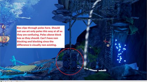 There are two kinds of poles featured in the gameplay area: The vertical ones don't restrict the movement of dynamic objects, while the horizontal ones do. The horizontal poles have a gameplay function - they are needed to block the player from moving dynamic objects past them. However, the vertical poles are not gameplay objects and shouldn't be placed in the gameplay area at all.

Fake Breakable Walls
- Breakable wall assets are meant to be used only when constructing breakable walls, not for anything else.
- Those art assets that look like breakable wall assets shouldn't be used for decorative purposes.
- No large wall chunks or any other noticeable debris should remain after the player has destroyed the wall. The player should know when the wall has been completely shattered and that there's nothing more to break.
- Trine 4 featured breakable crystal walls and used small crystal shards to indicate the moment the wall was destroyed. The right size and look for the crystals was found by tinkering with the contrast in size, saturation and value of the "decorative" crystal bits. The smaller crystal pieces blend into the background (at least more than the larger wall chunks).
-
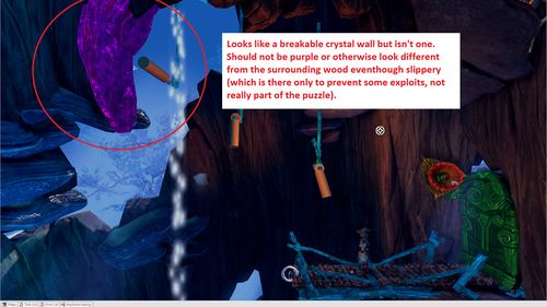 Trine 4 crystal walls are always coloured purple to avoid mixing up the breakable walls with regular, non-breakable structures. A very similar-looking asset is likely to confuse the player, as seen here with the purple object. The level artist should never use interactive gameplay object assets (or even assets that look like them) as decorative assets.
 -
 It's unclear whether there's still crystal pieces left to shatter or not. The "leftover" pieces should have their own distinct visual look that differs clearly from the breakable wall asset. You could try, for example, using a less covering, dull and desaturated colour that blends into the background for the small bits, while the actual breakable chunks are brighter and contrasted, standing out.


Fake Gameplay Objects
- You shouldn't use gameplay assets for decorative purposes inside the gameplay area or in the immediate vicinity of it (background/foreground). The player must know which objects can they interact with.
- The dynamic gameplay assets should be kept separate from the decorative (non-interactive) level art assets, visually setting the two apart.
- Don't create similar-looking assets that sometimes function as dynamic gameplay assets and sometimes can't be interacted with.
Fake XP
- No other game art assets should look even remotely similar to the experience collectables.
-
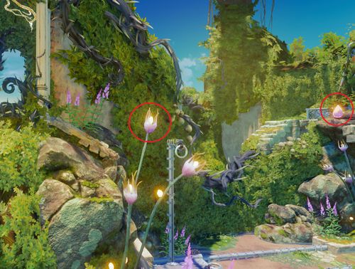 The flower buds in the foreground share their colouring with the XP collectables. The shape and size are also very similar.

Fake Ropetarget Rings
- Avoid placing small, camera-facing rings near the gameplay area. Players will have a hard time differentiating them from rope targets.
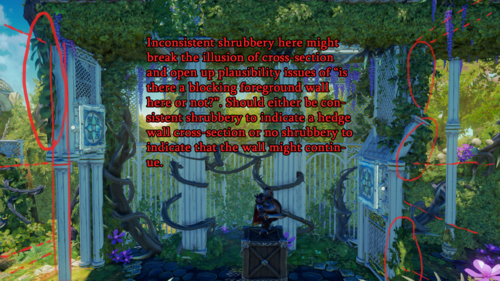
Plausibility issues in 2.5D
- When making a 2,5 D game, the level art plausibility concerns are usually focused on immersion and worldbuilding.
- However, sensible environmental planning benefits the gameplay as well. If the surroundings provide enough guidance and feel plausible, it reduces the risk of the player getting frustrated and blaming the gameplay for it.
Platformer logic vs normal logic in Trine
- "Platformer logic" refers here to the concept of abandoning all the 3D tools and solutions in favour and because of the 2D gameplay. Platformer logic can be applied to many Trine art and gameplay design decisions.
- Since Trine is attempting to co-pilot a believable 3D approach on the side, platformer logic isn't always the best solution for all the problems.
- Mixing 3D and 2D can lead the player to various frustrating situations. These situations can be made more acceptable with carefully chosen level art:
- For example, wallhead scenarios often force the player to a potentially dangerous 2D route and face to face with the fire-spitting wallheads (while the player might feel the 3D approach should allow them to avoid the danger by simply choosing another path). Level artists, however, can make the other possible routes look less appealing or not available, thus justifying the "platformer logic".
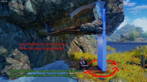
- Doors, on the other hand, should be placed in spots where using them is the only sensible solution. If there's a heavy door at the end of a puzzle chamber and a huge hole in the stone wall next to it, you can't blame the player for wanting to jump through the hole and then getting frustrated when the 2D perspective gameplay stops them.
- Level art should leave the player satisfied for choosing the right path ( = the path that forwards the gameplay) even when the right path doesn't seem to be the most logical one.

Visual support for platforms and mechanisms
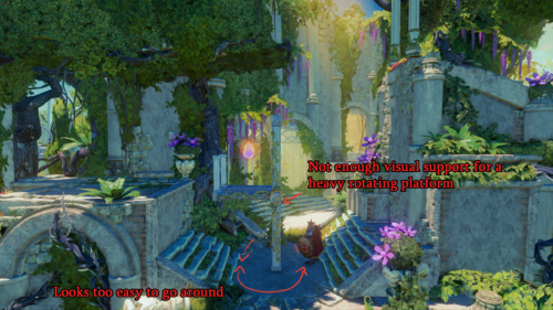
- You should consider the mass, weight and working mechanisms of the art object you're creating. Without proper support and volume to mirror the object's real-life properties, using it might feel unrealistic and not satisfying.
- This approach will also help in conveying the gameplay mechanisms to the player: A flimsy-looking support structure hints to the player that the platform might tip over. If the support structure looks strong, the player feels safer using it.


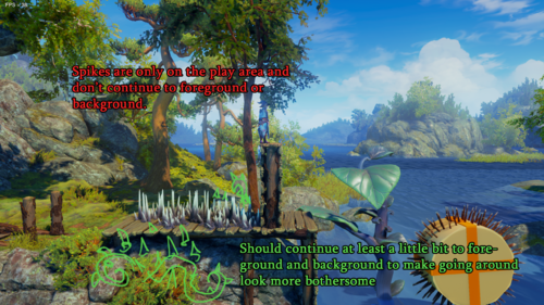
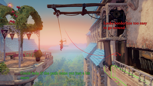
Path of least resistance should be on the 2D plane
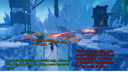
- The Trine heroes like facing challenges, but most players will choose a more manageable path over the hard one.
- Generally, selecting the path with the least obstacles/resistance feels better. The player's gaze tends to turn naturally towards the route that feels safer and more sensible.
- It's your responsibility as a level artist to ensure that the 2D plane/route should always feel like the most logical one.
- Sometimes, especially with puzzle elements, the 2D gameplay might feel frustrating and arduous. The level art should soften the blow as much as possible and reaffirm the player's route.
- For example, solving a puzzle to open a door might feel annoying if there are plenty of possible 3D art asset solutions dangling nearby and the player is unable to use them due to the 2D gameplay.
- The most efficient path doesn't always get chosen: A fun 2D platforming route can be much more tempting than a staircase in the background.
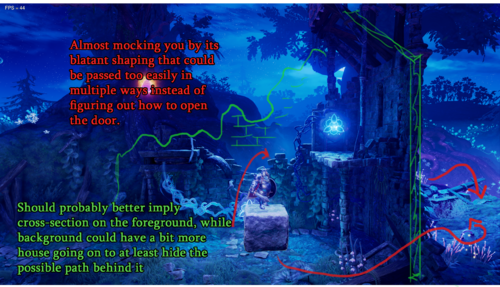
- Venturing into the unknown is considered unpleasant, and the player might feel uncomfortable selecting an obscure background path. However, figuring out how to open the door to the unknown is exciting.
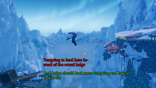
- A ledge invites the player to reach for it in the hopes of ledge-grabbing (instead of aiming for a platform with no ledge).
- Make sure the play area is the most tempting path for the player to take (instead of the other possible routes seen in the scene) and plan both the visual and geometrical routes accordingly.
- Make sure that the game play area has a clear contrast and that the player's intended path is prioritized visually.
Examples of possible issues
- See below for example scenes where the player might feel like the 2D plane/route isn't the best or the most alluring way to continue
-
-
-
-
-
-
-
-
-
-
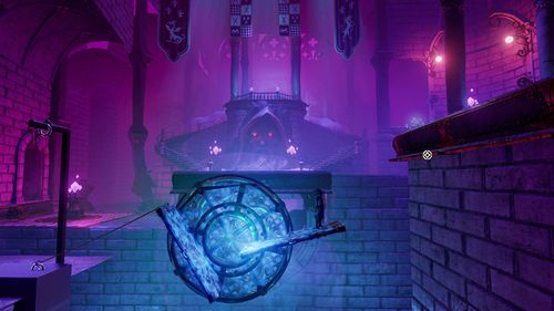
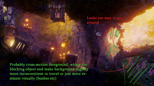
 It seems that the player could easily just walk in the foreground without actually solving the puzzle.


Examples of non-problematic solutions or issues succesfully averted
- Here are some examples showing how the play area / 2D plane seems like plausible and the most satisfying way to go, while other route options seem illogical or un-tempting


