Level Art: Composition
Jump to navigation
Jump to search
Related sites
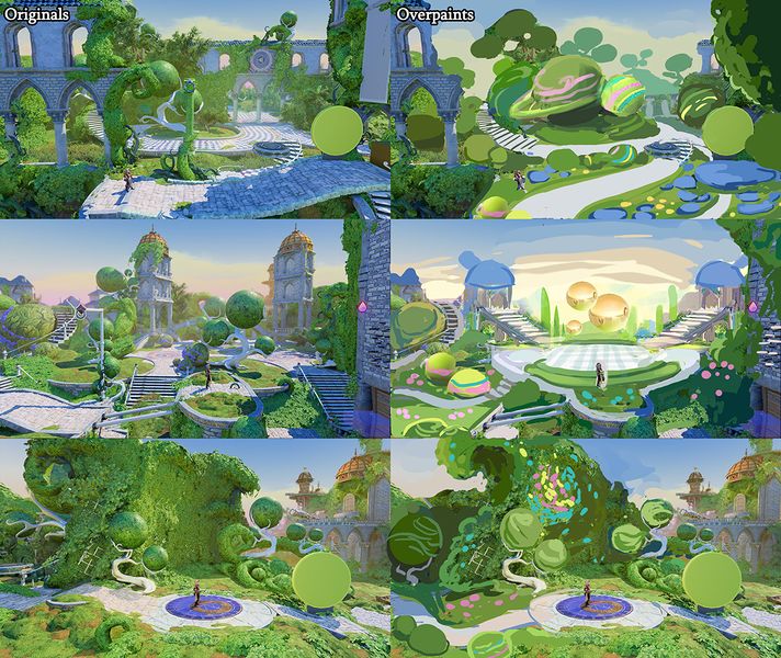
Composition and Forms
- Composition means the arrangement of shapes and forms in a scene, so to put it simply composition is just arranging different value shapes in a picture
- The composition should of course look nice but also guide the player to the right direction and support the gameplay
- The gameplay area in 2.5 style Trine games is quite narrow and the geometry of the gameplay area is mostly determined by the designers
- The the most visual impact within level art is in the background and foreground forms and with those everything is possible as it doesn't affect the gameplay
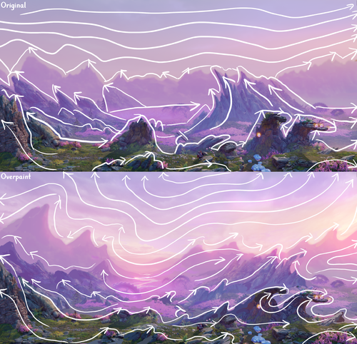
- As usual with Trine art style, overpowering straight lines and 90-degree angles in the big forms of the levels should be avoided
- The forms of the levels should be flowing in big arches with a clear flow trough the environment
- The aim is to achieve a dynamic and organic end result that guides the eye smoothly across the scenery and towards the direction where the player should be heading
- Break the 2D plane with overlapping elements and flows also leading into the depth (meaning the background)


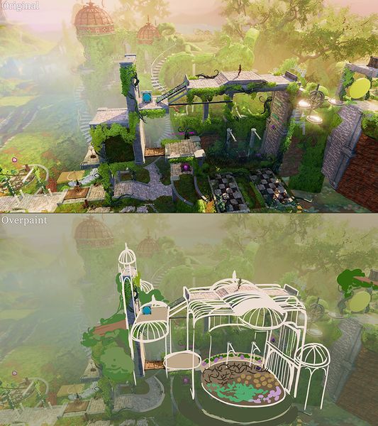
Base collisions have to support both gameplay and art
- Level artists can't edit the collisions made by designers without discussing with them first but sometimes they need to be edited in order to make the level art work properly
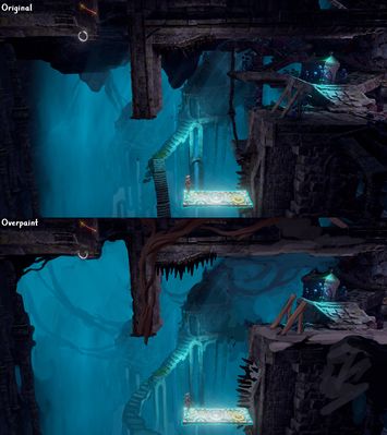
- Here is an example of a spot that worked for gameplay but didn't work at all for the art. The whole idea was to have a wide open scenery and without artist intervening this would have ended up looking crammed and the feeling of space wouldn't have been achieved
 Final result ->
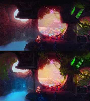
- Here is another example of how important it is that the artists are proactive with the base art changes to get the best out of the collision base, sometimes you just have to do big changes to make it work! Before the statue head was placed on the background of a puzzle and there was not enough space for this important focal point, so the end part of the level was moved to create space here and make this part work. The puzzle area was moved to the right so it comes after the statue.
 Final result ->
The right materials for the specific shapes
- Things don't always need to be realistic but they should be believable in the context of the world they exist in
- Pay attention to the materials you use for different areas for a believable result
- Heavy stone/rock/brick elements need enough support visually
- Big and heavy rock elements look even heavier floating on top of the player. Unless it's a cave these should be replaced with lighter structures like tree foliage
- Use different materials to differentiate areas, if the floor and walls are rock, use for example wooden materials for the gameplay related pillars so they stand out better
- Avoid 90 degree angles when possible
- Of course the level design is often blocky and unnatural looking to perfectly match with the level art theme, but there are ways to fool the eye and add organic feeling while maintaining the collision forms necessary for the gameplay
- Don't make weird rock shapes, in nature rocks can't be narrow flat walls nor 90 degree angled structures (or if they can that still isn't what we aim for)
- For very unnatural and even shapes use something man made looking, like bricks or change the material completely and use wooden structures etc.
- Only the gameplay area needs to follow the collisions exactly so you can have more organic shapes all around to smooth down some unnatural shapes on the gameplay area
- In most cases you can also use vegetation to make things more organic by kind of hiding the angular collision shapes under it
- Artist should never edit the collision without consulting the designers first, but in some cases editing is needed as some forms might not matter so much to the gameplay while they could be changed for the better from the art point of view. Still, always discuss with the designer first
-
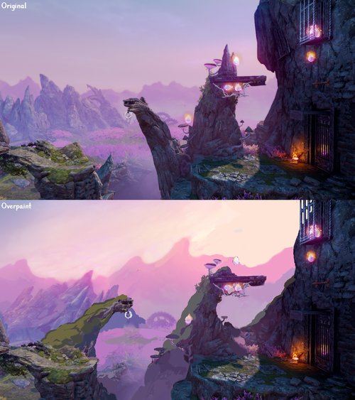
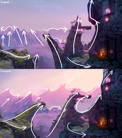
 It's hard to see the gameplay area poles as they are the same material as everything else around them. Also wooden material feels more natural for the long narrow shape.
 -
 An example of unnatural rock shapes that have been smoothed out with man made structures and vegetation in the overpaint
 -
 In this case the big structure on the top area works much better as vegetation instead of the heavy rock material as it doesn't have enough visual support to make sense as a rock material
 -
 An example of an unnatural narrow rock wall that would work much better as a wooden wall for example


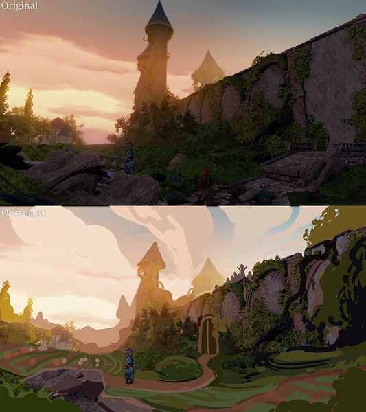
Flow
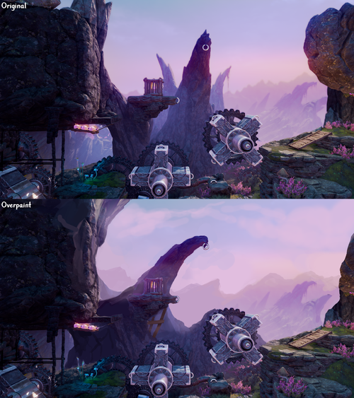
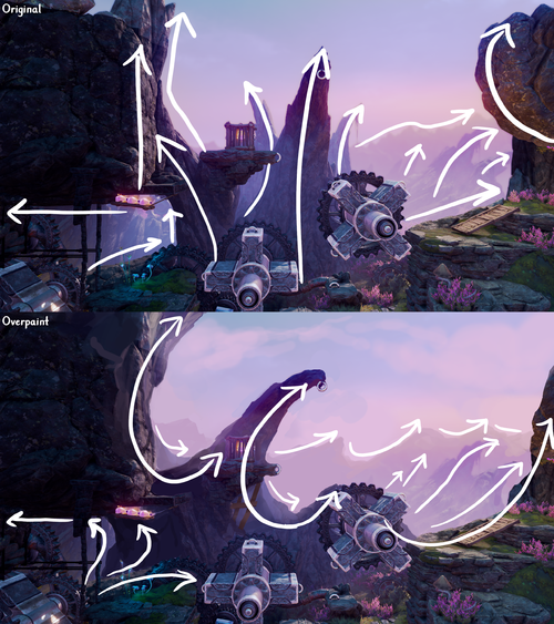
- Generally the level beginnings and level endings should have this type of composition to guide the player to the right direction visually
- The composition is formed from all the assets and value blobs on the screen, so it should work as a whole and not just for individual separate objects

- Think about the big shapes as just shapes in the first blocking phases. The shapes include everything visible, not only ground and assets on the ground, but also far away background objects like mountains and sky with clouds etc.

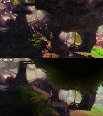
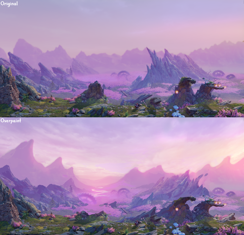
- Here is a screenshot and an overpaint based on it from the Trine 4 Rocky Heath level. It's the beginning of the level so it should look exciting and guide the player to start the level. Now it seems like any general view from the level. The beginning and ending of a level should always be special and a focal point area to mark the beginning and ending.


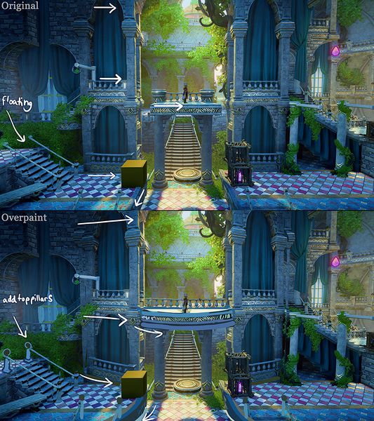
Gameplay area 2D plane
- We want to create a feeling of real world with depth and hide the fact that the whole game is actually just a narrow 2D plane and one straight road from left to right
- Only the collisions on the narrow gameplay affect gameplay, everywhere else (which is a much larger area) anything that art wants can be done! Of course everything should still support the gameplay as well as possible.
- Let's not let the design's collision blocks limit our creativity and possibility to make the level more organic and flowing
- Sometimes art can follow the 2D plane and it works but usually we want to break it and create an illusion of a vast world that is more than just the 2m wide gameplay path
- Problems that can occur when we don't question the original collisions:
- Highlighting the 2D plane where it's not needed: adding a road/houses/walls exactly aligned with the 2D plane
- Having obstacles or structures only 2m wide, so they do cover the gameplay area but look like a staged obstacle course that you could just walk past if the artificial 2D gameplay restriction wasn't present
- Adding necessary art to the gameplay area while leaving the background separate, which can work, but usually it's best to tie the different levels of depth together, blurring the line between the background, foreground and gameplay area
- Leaving the foreground empty or not paying the same amount of attention to the scene as a whole but just getting the "necessary" things filled
-
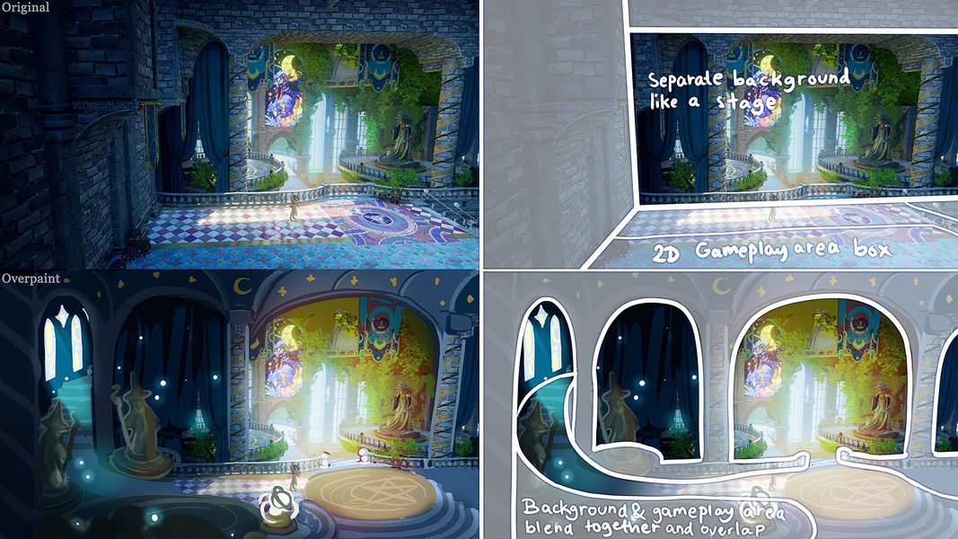 Visually separate background and everything aligned with the 2D plane
 -
 Everything aligned with the gameplay area makes the scene feel flat
 -
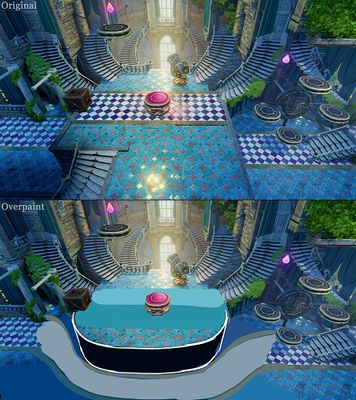
 In the level ending area it's often a nice looking trick to make the road bend into the depth
 -
 Examples of adding depth with roads that break the 2D plane
 -
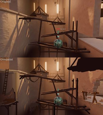
 Even though most of the structure will not be visible it helps to think the scene as a 3D building instead of the 2m wide 2D area


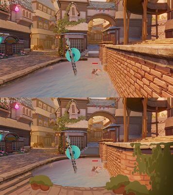
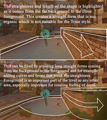
Too long straight walls perpendicular to the 2D plane
- Another 2D plane related thing is when long walls continue to the foreground, they can seem too long and too close to the camera so they should be avoided and instead curved walls etc. should be used
-
 An example of how to fix the too long 2D perpendicular walls
 -
 The issue explained in more detail
 -
 Another example of how to fix the too long 2D perpendicular walls
 -
 Also a gap like this has a similar issue as the wall has: too long straight 2D perpendicular shape. Doorways and windows or organic "holes" are a much better option. There should also be some gaps (window/broken areas etc) where the camera moves trough so that it doesn't go through the wall.


Variation
- It's important to have variation and contrasts in the shapes in all kinds of environments
- Especially with natural environments you should make sure to get the organic feeling across
- Areas that continue in a similar pattern for too long feel unnatural, monotonous and boring
- The rhythm of the area should not be repeating itself
- This principle can be used for terrain shapes, light and asset placement, everything really!
-
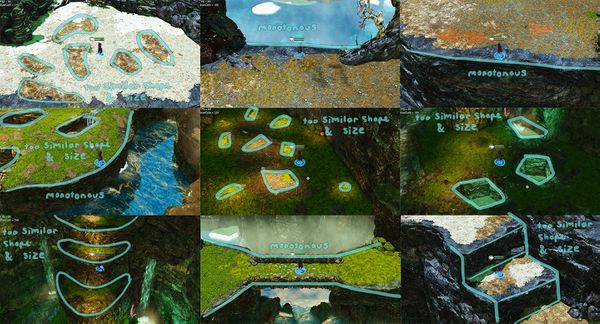 too similar and repeating shapes, too straight lines
 -
 more variation in shapes and sizes, breaking the straight lines
 -
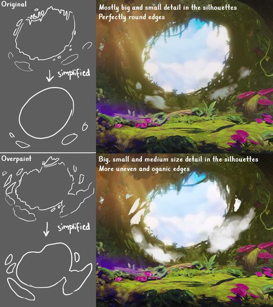 Too perfect circular shape with just small detail to break it, adding unevenness and having also mid sized shapes helps to make it more organic and interesting


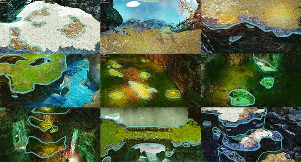
Avoid Repetition
- This applies to pretty much everything: textures, asset design (silhouette of the asset, details of the asset), level art etc.
- In Trine the aim is to avoid repetition. For example wall tiles are not just simple tiling of same shape, instead individual tiles vary in shape and orientation
- Repetition might mean for example detail placement and size variation on the object
- Placing objects in a "grid" looks repetitive, but scattering objects seemingly randomly can look repetitive too, if the objects are still placed about a same distance of each other and the objects are approximately same shape and size
- Have primary, secondary, and tertiary shapes meaning that primary shapes stand out most and can be immediately noticed on the first glance, followed by secondary and tertiary shapes
- Have large, medium, and small shapes. Have variety to the size of shapes in each of the three categories.
- Make sure these details are placed somewhat chaotically to avoid obvious patterns
- And make sure there are areas with lots of details, and areas of almost no details. Empty areas are as important as detailed areas in the big picture!
- Neil Blevins: Contrasts In Composition

Scale and Proportions
- Neil Blevins: Using Details To Make Something Look Big
- To avoid problems with scale use the characters as size reference at all times and see how an environment looks in game by playing and observing it often
- In levels it's important that the scale of objects compared to the characters makes sense and everything is consistent and logical
- Game worlds often have problems with scale, things might look too big or too small and that breaks the believability of the world, making the game feel substandard
- Generally you should trust your eye, and if something looks off, fix it. If something works even though it's scaled a lot, it's okay
- Basically everything is allowed as long as it looks good and optimal enough for the performance, but scale can sometimes be hard to get right, so here are some clear tips for that
- If an existing asset looks low quality (for example has a low texture detail) think carefully how to use it properly. It might be okay to place in an area where texture details are not that visible anyways. Otherwise ask the 3D art department for a possibility of getting a new asset.
Scaling assets
- It's generally okay to scale any 3D asset up or down 20% of its original scale (you can see if the asset has been scaled or is in its original scale from the model component "Scale VC3(1, 1, 1)". If the scale has been modified it is something else than 1)
- If you are planning to scale more, you should consider carefully whether there will be problems with too much detail or too little detail in the geometry or the textures of the model
- If an asset is scaled up, the texture will become more low-quality. When an asset is scaled down, it can become too detailed or high-quality compared to the other assets around it
Problems created by scaling 3D models too much
- Scaling an asset too much is relative to the case
- If an asset is for example far away in the background, surrounded by fog or dark, it might be ok to scale up a lot, but the silhouette and textures should still look good for it to work in the context
- When you scale an asset in editor its polycount and texture resolution won't magically follow along
- Assets are made in a specific texel density (basically the texture resolution) and it will only work nicely in the original scale of the asset. The more it's scaled the worse and less consistent with the other 3D models it'll look
- Texel density information:
Scaling up too much
- The texture resolution of the asset may end up being too low and blurry, and thus not cohesive with the rest of the assets in the same scene
- For the PC version of a game the scaled up asset's textures might look okay, but for example for a console version, where all the texture images might automatically be downsized, the textures can end up looking really pixelated, as everything has a lower resolution
- The polycount of the asset will not match the scale of the asset any longer and the asset starts to look more low-poly and angular
- A 3D asset is made with a specific polycount so that it has enough polygons to look smooth and nice in its intended size. A too large polycount isn't optimal either as that could affect performance
- The more the asset is scaled up, the worse and more low-poly and blocky its silhouette will look
- Even if a scaled asset's texture looks okay in the far away background, its silhouette can reveal it's been scaled
Scaling down too much
- The optimization will suffer as there will be way too many polygons, which will affect performance
- When a big asset is scaled to very small, the texture size will become too large compared to the scale
- The texture resolution may look too sharp and not coherent with the rest of the assets in the same scene

Non-uniform scaling
- Non-uniform scaling is usually a big no-no, but there are some cases where it can be a better option than uniform scaling
- Non-uniform scaling means that when scaling the object the X, Y and Z axes will not stay the same. For example X:1, Y:1, Z:2, so the object will lose its original proportions and become stretched
- Things that should never be scaled in a non-uniform way: Round shapes, object’s geometry or texture having more than one directions, textures with patterns or images that don’t work stretched.
- If an asset has a clear direction and no specific (for example circular) shapes on its texture it might be okay to scale it along that direction
- Example case: If you need a slightly wider platform but uniform scaling will result in an asset looking too big. In this case the non-uniform scaling is not noticeable, even though the asset is stretched, and it can be seen in the UV visualization
- However, if the object's geometry has more than one direction, or small patterns in it (for example circular shapes), the non-uniform scaling doesn’t work
